Contact us section :
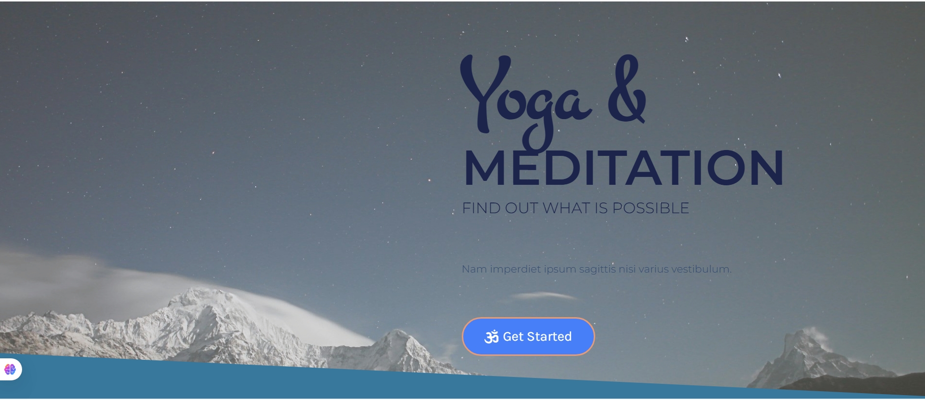
Video Background + Headings + Two‑column Inner (Form)
Layout: Full‑height hero‑style contact section; video background with colored overlay; centered content (max‑width ~1000px).
Top (content): Two headings (overline + “Contact Us”) above the inner split.
Inner split: Two columns: left “Our Location” (address + socials), right simple contact form (name, email, message, submit).
Responsive: Stacks with headings, then location, then form.
Rules: No animations; maintain overlay for readability; button uses brand color; keep form minimal.
Keywords: video bg, overlay, headings, left location + socials, right form, full‑height.
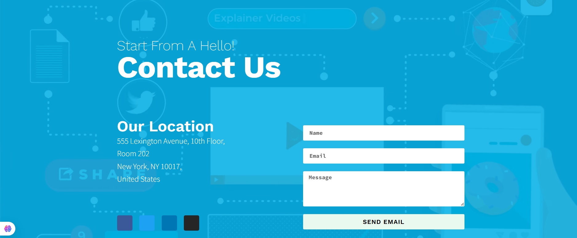
Contact us section :
Left Dark Info Panel + Right Map (Full‑width)
Layout: Full‑width section with background image; two main columns (≈40/60).
Left (content): Dark panel: “Get in touch” overline + brand heading + icon list (address/phones/email) + primary CTA button (phone).
Right (visual): Embedded Google Map inside a light/translucent panel; centered.
Responsive: Stacks with info panel first, map second.
Rules: No animations; ensure contrast (dark left panel, light right panel); keep button in brand color.
Keywords: left dark panel, right map, icon list, CTA button, background image.
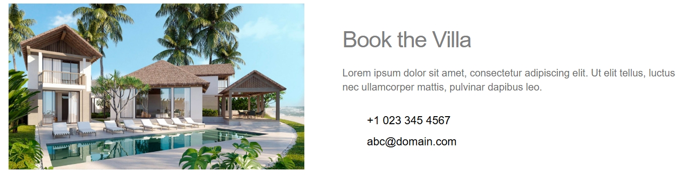
Contact us section :
Image + Text/Icons (50/50)
Layout: Two columns, ~50/50; left image (cover); right text block.
Left (visual): Single image (service/location themed), vertically centered.
Right (content): Heading + short paragraph + icon list (address, phone, email).
Responsive: Stacks with image first, then text/icons.
Rules: No animations; ignore any negative margins; use brand color for heading/icons.
Keywords: split layout, left image, right contact list, icon‑list, info panel.
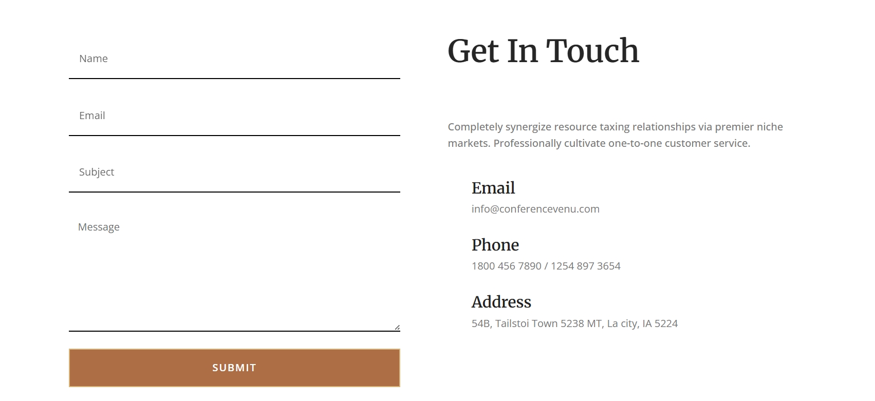
Contact us section :
Two‑column Form + Info (50/50)
Layout: Two columns, 50/50, max‑width 1200px, generous padding, white background.
Left (content): Contact form (name, email, message; clean single‑step).
Right (content): Contact details (address, phone, email) + social icons.
Responsive: Stacks on tablet/mobile; form above details.
Rules: No animations; preserve form fields; style with brand primary for button.
Keywords: contact form, two‑column 50/50, left form, right info, social icons.
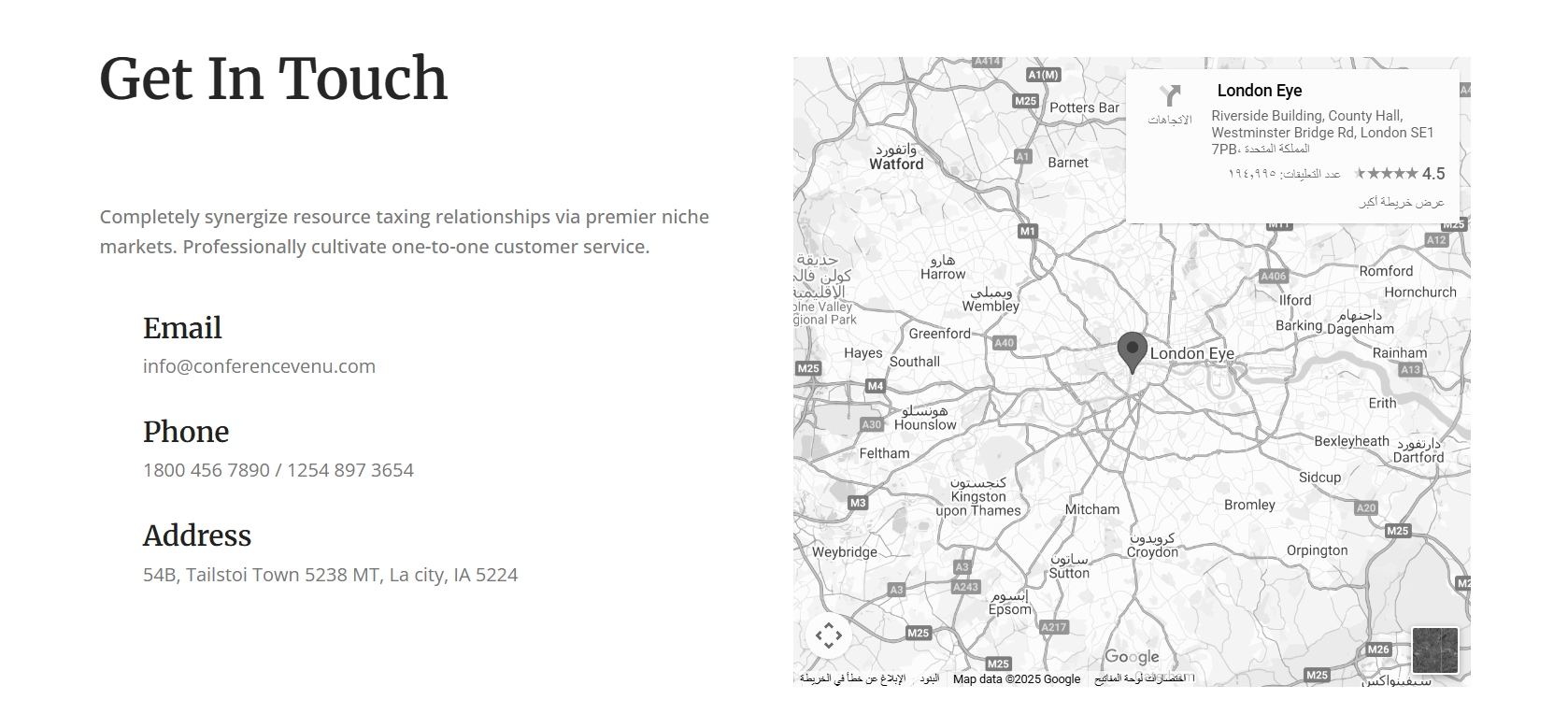
Cotact us section :
Two‑column Info + Map (50/50)
Layout: Two columns, 50/50, max‑width 1200px, generous top/bottom padding, white background.
Left (content): Contact details (address, phone, email) + social icons; tidy spacing.
Right (visual): Google Map widget, fits column height.
Responsive: Stacks to single column on tablet/mobile; content first, map second.
Rules: No animations; keep structure unchanged; apply brand colors to headings/links.
Keywords: contact, two‑column 50/50, left info, right map, social icons, white bg.
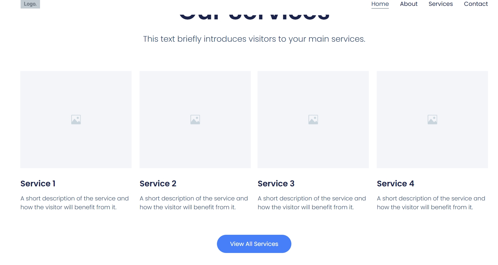
This section presents a clean and organized “Our Services” overview,layout: Section Heading:
The main heading for this section is “Our Services,” prominently displayed in a large, dark blue font.
Beneath it, there’s a subtitle or introductory text: “This text briefly introduces visitors to your main services.” This provides context for the services listed below.
Services Grid (4 Columns):
The core of the section is a four-column grid, showcasing individual services.
Each column follows a consistent structure:
Placeholder Image: A large, light grey square with a small image icon in the center acts as a placeholder for service-specific imagery.
Service Title: A bolded title like “Service 1,” “Service 2,” etc., identifying each service.
Service Description: A short, concise description below the title, explaining what the service entails and its benefits (“A short description of the service and how the visitor will benefit from it.”).
Call-to-Action Button:
At the bottom, centered horizontally, is a prominent blue button labeled “View All Services.” This button serves as a call to action, encouraging users to click for a more comprehensive list or detailed information about all available services.